Email Design | 6 min read
Email Design | 6 min read

Have you ever considered that colour affects how people feel about your emails or how they react to them? If you haven't, we're going to take a look at all things colour-related in this article to help you understand how colour can affect your campaigns and how you can be more colour conscious when designing your emails. (This is a must-read for those who are in charge of designing emails so don’t miss out).
Let’s talk about colour codes first…
In the online space, you may have heard people talk about hex colour codes. Hexadecimal colour or hex are a type of HTML colour code that is used to set the colours you choose. This is used for your website or emails. A lot of people also use RGB colour codes. For every RGB value your colour will also have a hex code. RGB stands for Red, Green and Blue and signifies the amount of each colour in a colour mix that is added to get to the colour you want. The first number represents red, the second number represents green and the third number represents blue. When you see any of these numbers as 0, it means there is none of the specific colour in your colour number. Feeling confused? Let’s look at an example to illustrate how
We’ve taken one of our Brand colours (a beautiful yellow) to show you the Hex code (FFDB58) and the RGB values (255, 219, 88). As you can see this colour contains the maximum amount of Red a colour can contain 255.

Now that we understand colour codes and values, we’ll look at how different colours can affect your mood.
How colours can affect mood or convey feeling?
Colour is such a powerful design tool but an often overlooked one. While you may not have a say in your brain’s colour scheme, it’s still quite important to consider what colours may mean to your customers and how they influence their decisions. Colour is also a great way to create consistency between what someone is reading and what someone is seeing.
Let’s run through 7 Colours and what they convey:
| FEELING | COLOUR | WHAT THIS COLOUR DOES OR REPRESENT |
|---|---|---|
| Neutral Sterile Cold Light | White | White is often associated with goodness and holiness as it’s used in religious practices It can however also be seen as sterile or cold and boring because it doesn’t stimulate the sense like other colours do |
| Hidden Power Control | Black | Black sometimes has associations with evil due to it representing darkness or the unknown. It does however have a strong sophisticated feel if used in a certain way (nodding to fashion experts always saying black is in style) |
| Growth | Green | Green is associated with growth as is evident through nature. It also conveys a peaceful feeling. Today however, green is also associated with money. |
| Trust | Blue | Blue has calm soothing effects. This is why you often see doctors wear blue. Blue is often used to convey values such as honesty and loyalty. |
| Optimism | Yellow | Yellow is a happy, cheerful and uplifting colour. If used in a certain way this colour can also lead people to feel anger or frustration. It can be quite straining on your eyes and this is why it is also used for high visibility gear! |
| Fun | Orange | Representing warmth and happiness, orange is a stimulating colour. It also is often associated with positivity and good health due to its associations with sunny days and bright lights. |
| Energy | Red | Red is seen as boosting energy and adrenaline. For most people red also is associated to passion and romance |
From the above, you can see that colours can have quite a drastic effect on the type of emotion people feel and can also sometimes convey contrasting emotions or feelings.
How can I use colours in my email campaigns?
When you are contemplating what colours to use in your email campaigns, one of the main things you need to consider is the association that that colour creates with your brand. Brand consistency and brand alignment is extremely important when it comes to your campaign and needs to remain number 1 before you even start thinking about your messaging etc.
So you have your defined brand logo and colour palette, how do you incorporate colour into your emails and not veer away from your brand CI? One of the easiest ways you can use colour to convey feeling and create effect is through your graphics, button colours and text colours. Using consistent colours in your campaigns will help your subscriber have a more seamless reading experience and most likely keep your email interesting and fun.
Colour can help you attract certain types of shoppers
Kissmetrics released the below informative graphic showing how colour can actually help you attract a specific kind of shopper. If you’re running an e-commerce store, paying attention to your colour scheme can help you craft messages that appeal better to certain kinds of shoppers which in turn helps you with your segmentation and personalisation.

Other considerations when it comes to using colours in your email marketing:
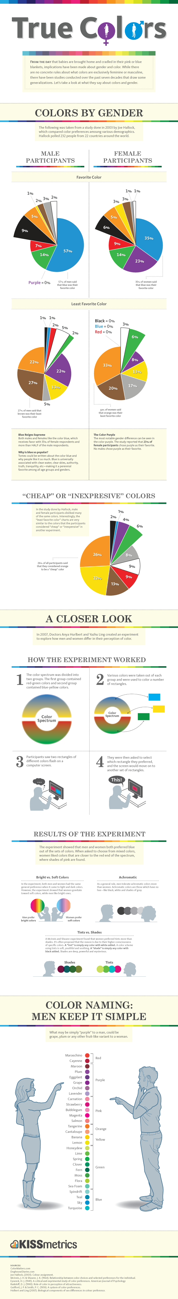
Gender
Did you know that studies have shown that men and women perceive colours in a different way? If your audience has a large representation of one gender above another, you might want to use colours that are more appealing to that gender. You can also use the knowledge you have to send out more personalised campaigns with different designs to your base to appeal to these preferences.
Kissmetrics did a big study called Colour By Gender. This study shows that blue is the colour picked by both genders when asked what their favourite colours are. Furthermore, the study revealed the following:
- Men like brighter colours whereas women are more attracted to soft colours.
- Women respond better to tints of colours (a colour with white added).

Find the full infographic here: Kissmetrics’s Colour By Gender study
Contrast
When you are using varied colours in your email campaign it’s important to consider contrast in your design. If you’ve got a certain colour palette you’ve now created for your campaign, you need to ensure you make sure your calls to action stand out. This means that if you have muted soft blues or greys in your email, you might want your buttons to be a brighter colour. This will ensure that your subscribers don’t just scan over your buttons but that they clearly see them.
Tools to help you pick the perfect colours for your email assets
Adobe Colour
Adobe Colour is a great tool for designers and offers quite a few colour-related features to help you not only create beautiful assets but also create functional assets.
Coolers
Coolers is probably one of the most well-known colour palette generator tools out there. This web-based tool helps you create colour palettes or will compile a colour palette for you.
Canva Colour Palette Tool
If you want to match your colours in your email to a specific image, you can upload the image into Canva and Canva will create a colour palette for you based on the image. Don’t forget, Mail Blaze has integrated with Canva which means you can easily create your email assets without the need to have multiple browser tabs open.
Now that you’ve learnt more about the psychology of colour in email marketing, all that’s left to do is to start implementing your knowledge and have fun seeing what works for your campaigns.
Let us know in the comments if you have any questions for us.
Explore further about Content Marketing article here.

The psychology of email marketing
Email marketing is not just about crafting compelling content and designing visually appealing messages. It's also about understanding the intricate workings of the human mind. Discover the psychol...

Marketing psychology: This is what influences your customers
Understanding the hidden aspects of consumer behaviour is within the scope of marketing psychology. This article looks at the major principles of marketing psychology to enlighten you to go above a...

The Psychology of Colour in Email Design
Colour affects attention, hierarchy, and click-through before a subscriber reads a single word. Here's how to use it deliberately.
Explore further about Content Marketing article here.
The psychology of email marketing
Email marketing is not just about crafting compelling content and designing visually appealing messages. It's also about understanding the intricate workings of the human mind. Discover the psychol...
Marketing psychology: This is what influences your customers
Understanding the hidden aspects of consumer behaviour is within the scope of marketing psychology. This article looks at the major principles of marketing psychology to enlighten you to go above a...
The Psychology of Colour in Email Design
Colour affects attention, hierarchy, and click-through before a subscriber reads a single word. Here's how to use it deliberately.
The psychology of email marketing
Email marketing is not just about crafting compelling content and designing visually appealing messages. It's also about understanding the intricate workings of the human mind. Discover the psychol...
The psychology of email marketing
Email marketing is not just about crafting compelling content and designing visually appealing messages. It's also about understanding the intricate workings of the human mind. Discover the psychol...
Marketing psychology: This is what influences your customers
Understanding the hidden aspects of consumer behaviour is within the scope of marketing psychology. This article looks at the major principles of marketing psychology to enlighten you to go above a...
The Psychology of Colour in Email Design
Colour affects attention, hierarchy, and click-through before a subscriber reads a single word. Here's how to use it deliberately.
Still haven't found what you are looking for?
Book a demo with us and see Mail Blaze in action, or reach out to our support team for expert assistance. We're here to help you every step of the way!
Still haven't found what you are looking for?
Still haven't found what you are looking for?
Book a demo with us and see Mail Blaze in action, or reach out to our support team for expert assistance. We're here to help you every step of the way!
Book a demo with us and see Mail Blaze in action, or reach out to our support team for expert assistance. We're here to help you every step of the way!
2026 © Mail Blaze. All rights reserved.