Engagement | List Health | 4 min read
Engagement | List Health | 4 min read
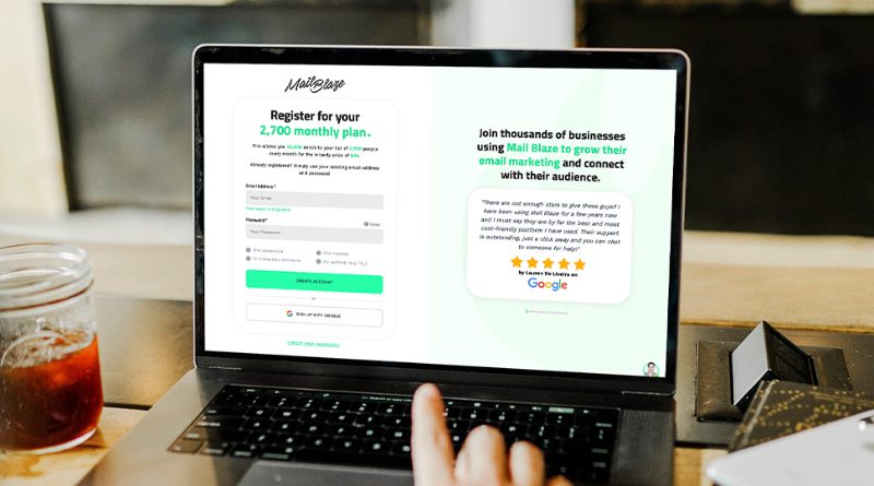
Most email sign-up pages are an afterthought. A box, a button, and a vague promise. Sign up for our newsletter.
Sign up for what, exactly? To receive what? Delivered how often? From whom?
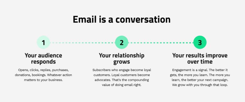
The result is a list that grows slowly, attracts the wrong people, and disengages quickly. Not because email doesn't work. Because the conversation started badly. A sign-up page is not a form. It is the first moment a potential subscriber decides whether they trust you enough to let you into their inbox. Get this right and everything that follows is easier: better open rates, more engaged readers, fewer unsubscribes. Get it wrong and you spend months sending emails to people who barely remember signing up. Here is what actually makes a sign-up page work.
Give people a reason that is specific to them
Stay up to date is not a reason. Be the first to know is not a reason. These are placeholders for a value proposition that has not been thought through yet. A strong sign-up page answers one question before the visitor even thinks to ask it: what am I actually getting here? The answer needs to be specific. Not marketing tips but one practical email marketing idea every week, based on what we see working across our clients right now. Not our latest news but new property listings every Friday morning before they go to the general market. Specificity does two things. It attracts the right subscribers, people who actually want what you are offering. And it repels the wrong ones, people who would have signed up, disengaged, and dragged your engagement metrics down. Both outcomes are good.
Ask yourself:
If someone read my sign-up page and described it to a friend, what would they say? If the answer is it's a newsletter, you haven't given them enough to work with.
Show the person behind it
People subscribe to people, not platforms. If your sign-up page could belong to any business in your industry, it will convert like every other average sign-up page in your industry. Who is writing this? What do they know that other people don't? Why should someone trust their expertise enough to give up their email address? This doesn't have to be elaborate. A name, a photograph, and two sentences about why this person is worth listening to on this topic can transform a generic subscription form into something that feels personal. It changes the transaction from “enter your email” to “join a conversation with someone worth talking to”. The businesses that build the most engaged email lists tend to have one thing in common: a recognisable voice behind the content. Someone the reader feels they know, even before they've met.
Be honest about frequency and format
Inbox anxiety is real. (we wrote a whole article about it here ) Before someone subscribes, they are already calculating whether this is going to become another email they ignore. Remove that uncertainty before it becomes an objection. Tell people how often you send. Tell them what format to expect. Tell them it is easy to unsubscribe if it is not for them. This transparency does not cost you subscribers. It earns you better ones. The subscriber who signs up knowing they will receive a detailed email every Tuesday is far more likely to open it on Tuesday than the subscriber who had no idea what they were getting into. Expectations set at sign-up shape behaviour for the life of the subscription.
Make the first thing they receive worth it
The sign-up page sets the promise. The welcome email is where you keep it. Whatever you offer on that page, deliver it immediately and deliver it well. Most welcome emails say thank you and tell the subscriber to look out for future emails. This is a missed opportunity. The welcome email is the highest-opened email you will ever send. The subscriber just said yes. This is the moment to show them they made the right decision. Give them something genuinely useful in that first send. Show them what the relationship is going to look like. Make it feel like the beginning of something, not a receipt for having signed up.
The elements that earn the click
To bring it together, a sign-up page that converts well tends to include:
- A specific, honest description of what the subscriber will receive
- The frequency of sends, stated clearly
- A brief sense of who is writing and why they are worth listening to
- One piece of social proof: a testimonial, a subscriber count, or a quote from a reader
- A low-friction form: name and email is usually enough. Every additional field reduces completion rates.
- A clear picture of what happens next: the welcome email, the first send, what to expect
Building your sign-up experience
Mail Blaze gives you tools to build and manage your subscription experience from end to end.
- Landing pages (under the Brand Hub) let you create focused, standalone sign-up pages without needing a developer or a separate tool. Clean, on-brand, and connected directly to your list so new subscribers flow in automatically.
- The Brand Hub gives you full control over what happens after someone signs up. Customise your subscription workflow; the confirmation email, the welcome message, the double opt-in process, and the subscriber journey from their very first interaction with your brand.
- List Settings: Consent management ensures that every subscriber on your list has actively chosen to be there. This is not just good practice for compliance. It is the foundation of a list that actually engages. Subscribers who gave clear consent open more, click more, and stay longer.
All three are available on every Mail Blaze plan.
Explore further about Content Marketing article here.

Image blocking in email
If you want to find out more about email image blocking (and what you can do about it), this is the article for you.

The email marketers periodic table of elements
Learn all about email marketing by taking a closer look at all the elements involved in the email marketing journey.

A comprehensive guide to open rates
Better open rates usually translate to better click-through rates, but now you see your open rates are declining. What do you do? This article will unpack the science behind email open rates and he...
Explore further about Content Marketing article here.
Image blocking in email
If you want to find out more about email image blocking (and what you can do about it), this is the article for you.
The email marketers periodic table of elements
Learn all about email marketing by taking a closer look at all the elements involved in the email marketing journey.
A comprehensive guide to open rates
Better open rates usually translate to better click-through rates, but now you see your open rates are declining. What do you do? This article will unpack the science behind email open rates and he...
Image blocking in email
If you want to find out more about email image blocking (and what you can do about it), this is the article for you.
Image blocking in email
If you want to find out more about email image blocking (and what you can do about it), this is the article for you.
The email marketers periodic table of elements
Learn all about email marketing by taking a closer look at all the elements involved in the email marketing journey.
A comprehensive guide to open rates
Better open rates usually translate to better click-through rates, but now you see your open rates are declining. What do you do? This article will unpack the science behind email open rates and he...
Still haven't found what you are looking for?
Book a demo with us and see Mail Blaze in action, or reach out to our support team for expert assistance. We're here to help you every step of the way!
Still haven't found what you are looking for?
Still haven't found what you are looking for?
Book a demo with us and see Mail Blaze in action, or reach out to our support team for expert assistance. We're here to help you every step of the way!
Book a demo with us and see Mail Blaze in action, or reach out to our support team for expert assistance. We're here to help you every step of the way!
2026 © Mail Blaze. All rights reserved.